

Finlandica
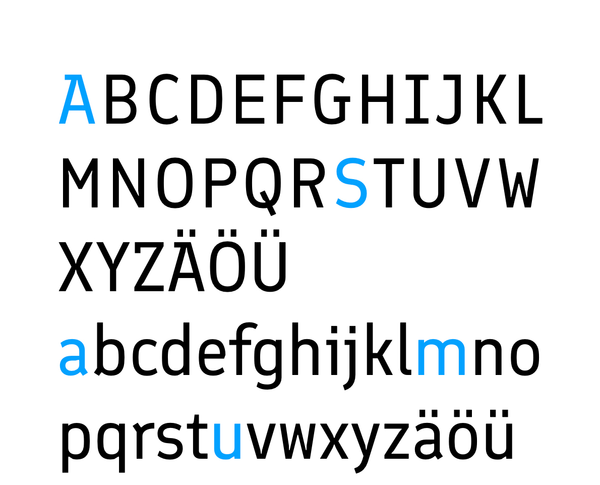
Next step was: finding a prober script. Proper means: looking like a handwriting, but also being readable!
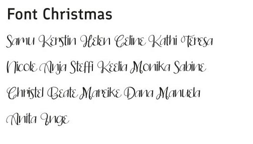
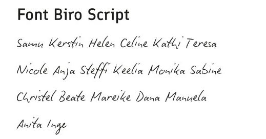
So I set up a file with names, because I wanted to see, how the names would apear in that font.
Not all of my collection of scripts, but quite a few. My dearest friend and me had had a very intensive chat about it.
Just some examples, some of my font
Hier mal ein paar Beispiele, some had already maneuvered themselves into a dead end. As I mentioned before, a script has to be reable as well. Some work better in bigger fontsizes, others also in smaller.
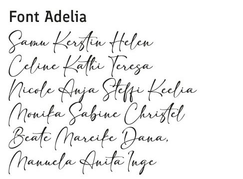
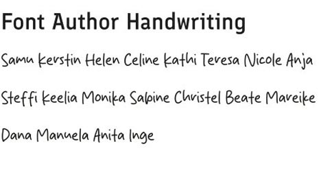
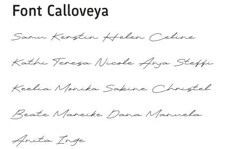
Typesetting instructions
The typesetting instructions, what font for which purpose and the size has been written by myself. Usually the publishing company instructs the media designer. Some book series are layoute with the same fonts or the same format.
It was also important to find a format for our book. The size influences the number of pages.
I had decided beforehand to use a convenent and common format. A non-professional would call it: paperback or pocketbook.
The choosen size was 125 mm x 190 mm – somehow everybody in my field calculates with milimeter, and fontsizes in, Schriftgrößen in points.
The non-professional might think: Why not A4 like my printer uses it, so nice, so common, so standard. Measurements of A4 is: 210 x 297 mm. Not very handy, while reading, maybe if it is a protocol. Not sure.
Next smaller DIN format is 148,5 x 210 mm – you see: first we mention the width and then the length. A5 is also not very handy for a book. A publisher friend once told me: looks nasty on the shelf!
The printers also offered for 125 mm x 190 mm a very resonable price. Certainly it also depends on the number of pages in the end, and the edition, which is the number of books that will be ordered.
When knowing the format, you have to think about the margins.
Our margings have been:
top 23 mm. down 28 mm
inside 15 outside 22
Now you might ask yourself: what does inside and outside mean, in this case?
Since we have opposite sides, a right and left margin would change depending on the page (uneven page numbers and even page numbers)
Therefore everything, wherever the pages of our book meet, is inside iand the other page margin is outside. The more pages your got, the bigger the inside margin should, coz you want to open the book easily.
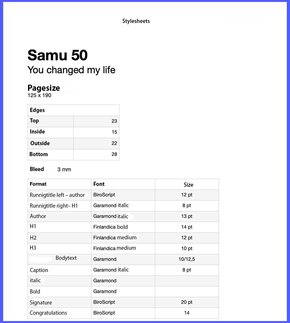
In my typesetting instructions /stylesheets the pagination is missing. I set it in garamon, 8 pt. Pt is the common abbreviation for point.
Layout and Typesetting
Next step was, to create the layout in my typesetting program. You don’t use word processing programs like word, open office for this purpose. As the name tells: you use them for writing texts and also formating them, but they are not very usefull for a proper layout.
A couple of years ago I was handeling the work with Adobe InDesign. Meanwhile the cloud subscribtion got incredibe expensive.
(looking for a sponsor 😂😂😂😂).
A couple of years ago I decided to switch to Affinity Publisher, a British company.
One paying and all yours for the rest of your life, including updates. When I switched, the price of the program was 78 €, but a black friday deal – first time I ever bought something at a black friday – made it only 37 €! Awesome!
Sure you had to learn a lot well known things newly, but step by step you will get more use to it. With our project I figured out how to set up footnotes or eye-catcher-dots in front of a paragraph with heart emojis. Really nice.
I started with master pages for the layout, and saved a template. So I got a kind of basis for all articles.
Then stylesheets. Some styles can depend on another one. Like headline 1 and 2 just differ in font size.
I can define stylesheets for different languages, since we use German, English and Finnish in our book. And every language has different hyphenations.
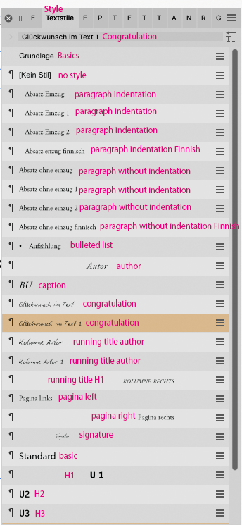
So I spent the night of christmas eve with typesetting, until 3 in the night. Then I got a bit tired and sleepy
But having to serve 25 authors the work needed almost a week. Love this kind of work. Probably the same feeling Samu got, when working in studio and trying to get the best out of every song.
Before adding the pictures to the articles, I processed them in Photoshop, my only luxury made by Adobe, best picture processing program ever, state of the art. So I opened the color pix in photoshop to convert them to greyscale. A non-professional might think: ok that is black and white!
Im my world a true black and white is kind of line drawing, a pencil on white paper!
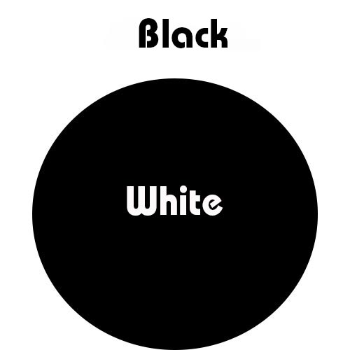
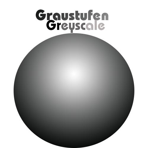
If the images had been printed in color, the entire project would have cost at least five times as much as it actually did.
But pictures had to be processed as well.
Our smartphones and computer use the so called RGB model.
You can call the colors of light. If you use a three spotlights in red, greem and blue, and focus them on one point, you will geht white light. You can’t create black light with that method. Black in this case is darkness = no light at all!
While printing, we use the CMYK Model.
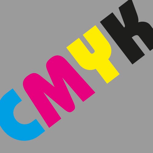
You might know this model abit from school, art class. Remember your old ink cartridge?
I guess you have experimented by mixing colors on your paper. And once all colors together and getting a kind of mud-brown-grey-what-ever. But never black.
So I had to convert any way!
Putting the beautiful pictures into the texts, and creating a PDF.
It was mid of january and the work had already taken a while. But there was more work todo.
Beside the task schedule, there was also a kind of time table!